A brokerage site where the listings make the pitch
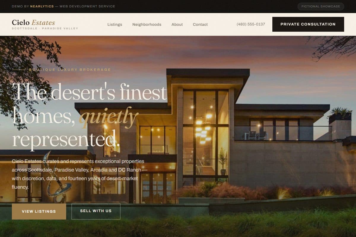
Luxury real estate sites tend to bury the homes under the agent’s headshot and a wall of adjectives. This one is built the other way round: the photography leads, the copy stays short, and the one thing it asks for is a private valuation.
The problem
At the top of a market, sellers do not choose an agent from a search result. They check — after a referral, after seeing a sign — whether the brokerage looks like it belongs at their price. A site cluttered with portal-style feeds, pop-ups and “what is my home worth?” widgets fails that check in seconds, whatever the agent’s record.
The approach
A curated collection, not a feed
The listings section shows six homes, on purpose — for sale and sold side by side, each with its address, beds, baths, square footage and price under large photography. A short collection says more about selectivity than an endless MLS feed. Neighborhood medians follow, so the brokerage shows it knows the market zip code by zip code, and the founder section explains why the book is kept small. The single ask is a private valuation, framed as a forty-minute conversation with no listing agreement required.
What’s in the build
- A full-bleed, photography-led hero with a property search bar across it
- A six-home featured collection mixing for-sale and sold listings, each with the facts a buyer screens on
- Neighborhood cards with trailing-twelve-month median sale prices
- A founder and broker section with closed volume, specialty and languages spoken
- A private-valuation offer, and an enquiry form that separates buyers, sellers and off-market interest
- RealEstateAgent structured data with the office address
Who this fits
- Boutique and luxury brokerages, and independent agents working a defined area
- Agents whose listings and photography are their strongest argument
- Brokerages that want seller enquiries rather than portal-style buyer traffic
Decisions worth explaining
Fewer listings, on purpose
Showing everything is what a portal does. A boutique brokerage sells selectivity, and a short, well-photographed collection makes that point before a single word is read.
Ask for a valuation, not a sign-up
The most valuable visitor is a seller, and sellers do not want to land on a drip campaign. “Request a private valuation — no listing agreement required” is a low-commitment step that still starts the conversation that matters.
Editorial, not portal
Cream, ink and desert tones with serif display type — closer to a magazine than to a listings site. At this price point the website is part of the presentation the seller is buying.
About this demo
Cielo Estates is a fictional brokerage built to demonstrate the approach. All listings, statistics, testimonials and press mentions are invented, and the photography is royalty-free. In the demo the search bar and enquiry form are front-end only — in a real build they connect to your listings feed, CRM and calendar.
Questions
What does a real estate website like this cost?
Our landing-page work runs $800–$2,500 and goes live in 2–3 weeks. A single-page brokerage site with a curated collection and an enquiry form sits in the lower-to-middle part of that range; a live listings feed and CRM integration move it up.
Can it show our live MLS listings?
Yes. A real build can pull listings through an IDX feed from your MLS, or keep a hand-curated featured collection like the demo and link out to the full search. Many boutique brokerages do both: curated on the home page, full search one click away.
Does a site like this bring in seller leads?
That is what it is built for. The valuation offer is the main call to action and the enquiry form separates sellers from buyers, so a seller enquiry does not sit in the same pile as general questions. The follow-up — a calendar booking, a reminder, a CRM entry — is set up per brokerage.
Let’s start
Let’s talk about
your business.
20-minute discovery call. No pitch, no pressure — just a conversation about what your business actually needs and whether we’re the right fit.